Lumena Foundation

Investing in Women

The Situation

Motivated by a strong conviction to use their privilege to do as much good as possible, the founders of a young foundation began offering trust-based grants to non-profits supporting women and women’s rights. Its grant recipients are courageous changemakers who challenge the status quo of how support can be given to women and other marginalized genders in an increasingly difficult landscape. To balance the power dynamics often found between the funder and the grantee, the foundation offers multi-year, unrestricted grants; a relationship-based reporting process free of formal documentation; and regular one-on-ones to promote open dialogue.

Our Approach

Where the founders and board had strong values and clear convictions, the foundation’s brand lacked the same confidence and clarity. We stepped in to conduct a robust research and discovery phase to guide the team on its branding journey. For the founders, finding moments of joy is a necessary constant in the fight against oppression and regression. It’s central to their character. This became the source of our brand idea—pure and vibrant joy. The new name represents the radiant source of hope that Lumena and its grantees provide for all women—the sun beams and the moon reflects. Leaning into the brand idea, we developed their brand platform, messaging, visual identity, and digital presence to evoke these characteristics. Armed with a pragmatic brand that they can carry forward and a newfound confidence, the Lumena team is setting off into their communities to find new sources of light that are ready to break through the darkness.

Lumena logo

Logo

The logo’s symbol represents the reflective relationship between the moon and the sun and their role in illuminating dark spaces. The symbolic approach takes inspiration from moon glyphs and gender symbols since Lumena’s take on all women is total inclusion.

Lumena color palette 2

Color Palette

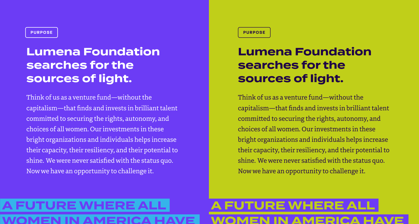
The color palette utilizes a vibrant purple as the primary. Purple is often associated with women’s organizations, but Lumena’s purple brings a cooler, punchier, and more contemporary tone to the space. This purple aligns with accessibility standards and can be used in a variety of shades to replace what would typically be a standard black—especially in text—keeping the whole identity vibrant, saturated, and cohesive. Bright secondary colors are used as accents and identifiers. As a whole, the color palette sparks joy and brings brightness to dark spaces.

Lumena type
Lumena icons set

Iconography

Lumena believes in a holistic approach to giving that is specifcally designed for women to thrive. By identifying and creating icons that represent the five dimensions of well-being, we help articulate what a woman’s right to self-determination looks like. On the Lumena website, the icons animate on hover to bring them to life.

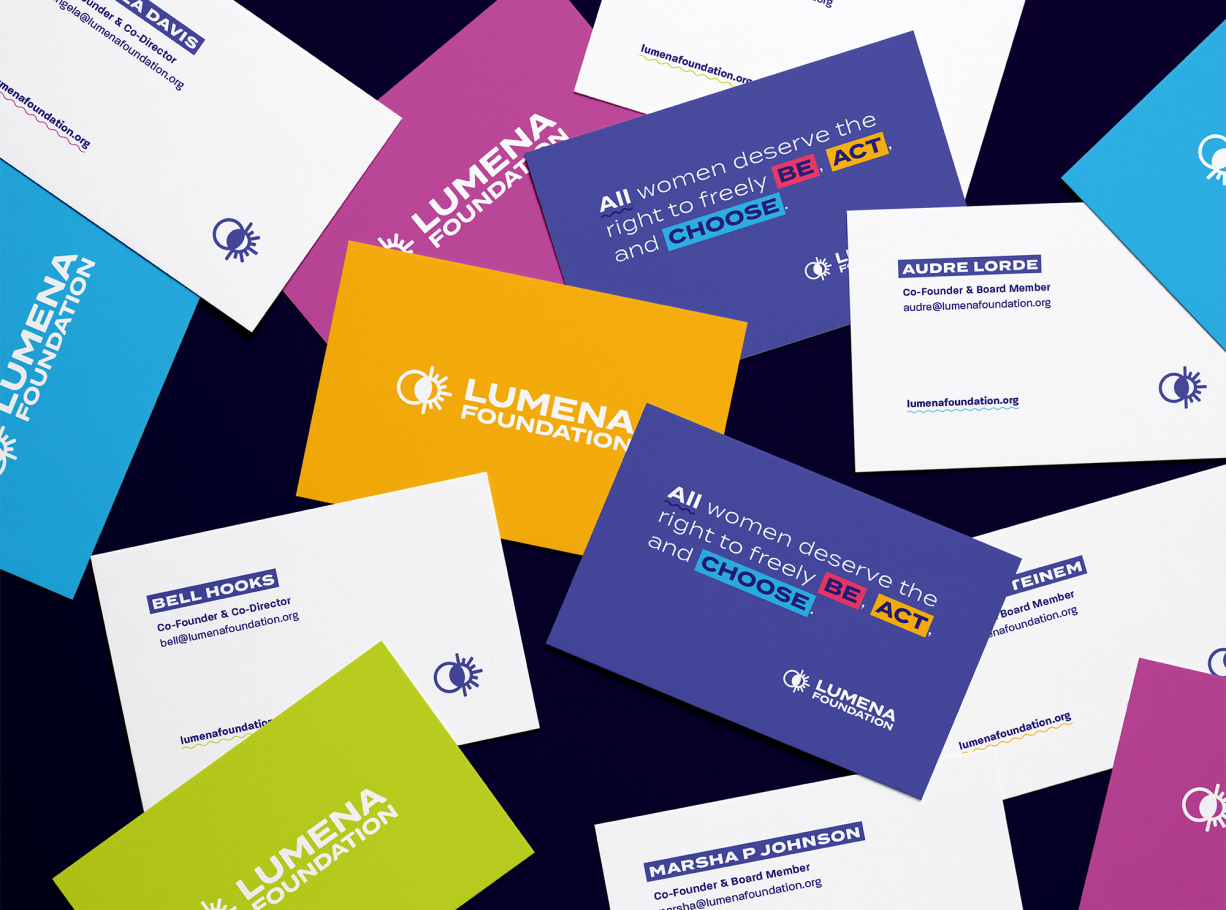
Lumena business card scatter mockup
Lumena stationery

Proof

Working with Untuck was such a rewarding experience. They supported (and challenged) us at every stage, resulting in a brand that we're so proud to call our own. We now feel a deep sense of clarity and confidence as we engage the world with the work of our foundation.

— Andrea Devereux, Co-Founder & Co-Director, Lumena Foundation

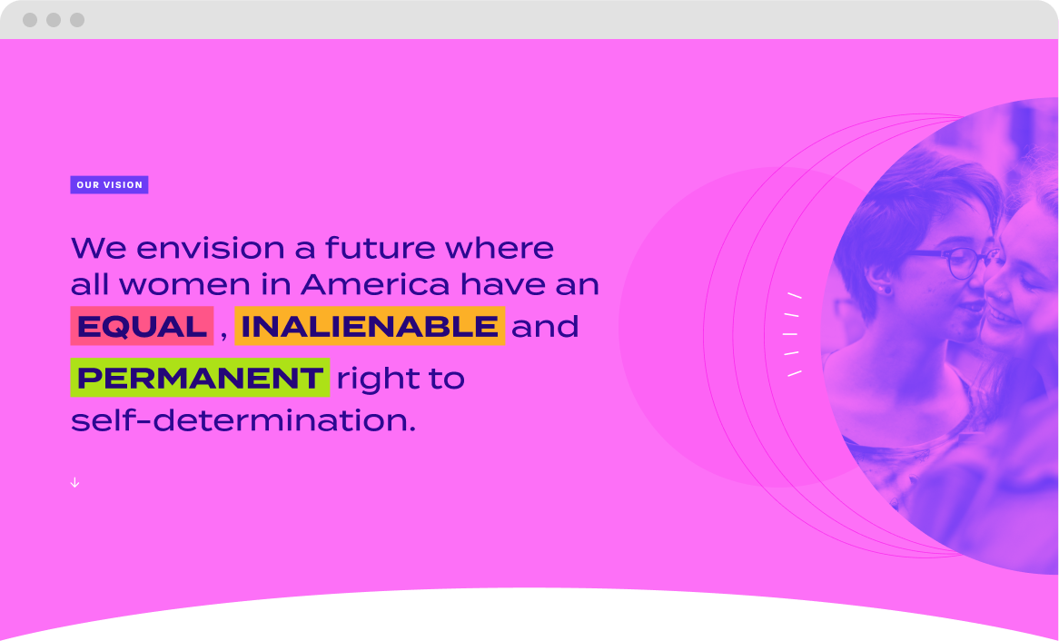
Lumena website
Lumena website slider 1
Lumena website slider 2
Lumena website slider 3
Lumena website slider 4

Other Projects

Jenkins mag covers feature

Jenkins Arboretum & Gardens

Encouraging New Growth

Untuck mastery charter featured

Mastery Schools

To the Top Together

Untuck temple brochure featured image

Temple University

Fly at Temple